
A retail investment app needed to reach two audiences it wasn't built for. Working alongside a Principal Product Designer, I ran the strategy, shaped the wireframes, and handled execution and client presentations. I used AI as a real working partner throughout, not as a shortcut.

Built for one investor. Needed to work for two more.
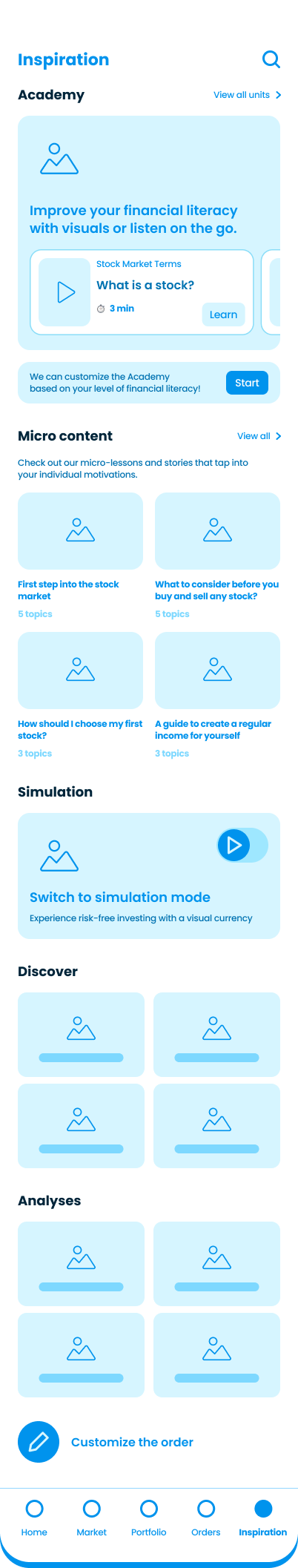
A retail investment app wanted to reach two audiences it wasn't connecting with: tech-native younger users who expected something more game-like and exploratory, and white-collar, entrepreneurial investors who wanted to invest with more confidence and structure. The product had the tools and market data to support both. It didn't have a way to bring either audience in and keep them there.
User problem
Users knew their goal. The app couldn't help them reach it.
People came in with a real financial problem to solve. The app couldn't show them where to start, how to continue, or how to make progress. It offered tools, but no path through them. Without guidance, knowing your goal wasn't enough to act on it.
Business problem
Locked into today's investors, missing tomorrow's.
The product served experienced investors well. It couldn't reach tech natives or entrepreneurs, the audiences the business needs now and in the years ahead. These users matter for growth, not just today's numbers. Failing to convert them left the business exposed to the wrong future.
My scope ended at handoff-ready wireframes across all three pillars. What the work produced was a defined strategy the team could build from, wireframes that made it tangible enough to present and align on, and prototypes that tested the logic before anything went into development.
I worked from a clear focus to detailed wireframes, then went back to the start twice when the work needed more than a fix.
Working closely with the Principal Product Designer, I ran a session to set the project's priorities. We proposed a full IA restructure. It got scaled back twice, first internally, then by the client. The bold idea didn't survive contact with the roadmap, but it shaped everything after.
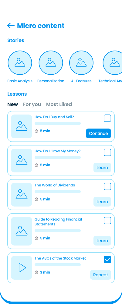
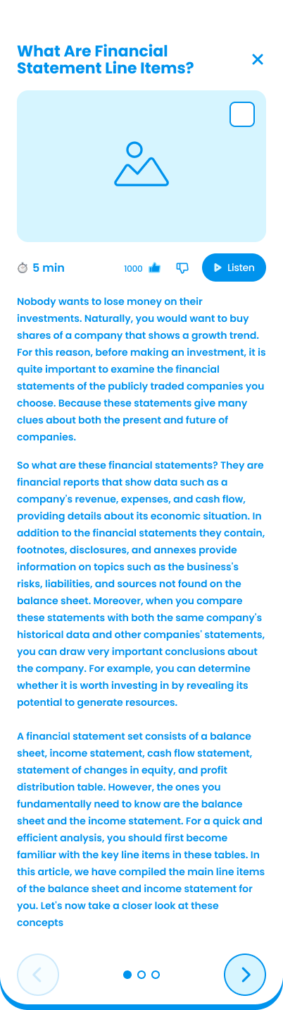
With direction set, I worked through the full scope alongside the Principal Product Designer. Simulation flows, learning layer, gamification system, every pillar needed wireframes before the project could move into UI.
I started UI work inside the existing patterns, getting flows and structure solid, before pushing into more exploratory design once that foundation held. The freedom to experiment came after the basics were trustworthy, not before.
After the GM's feedback, I rebuilt the simulation concept from scratch rather than patching it. Later, the team redirected away from simulation. I went back into discovery again, explored gamification mechanics for the learning pillar, then realigned on the overall framework before closing out the wireframes.
Working inside someone else's system was a constraint
SDK boundary
A technical SDK limited what we could touch. We had to design new entry points without modifying the pages and widgets outside our scope. The constraint shaped where simulation could live in the app.
Data provider limits
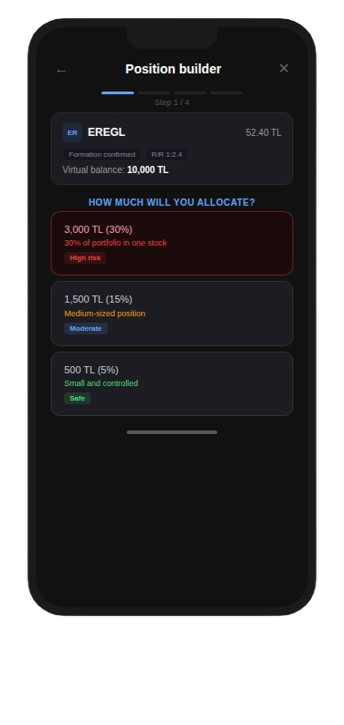
Technical difficulties with the market data provider's integration kept simulation lightweight. Buy and sell only, watch the position grow over time. The constraint shaped the final scope, not the ambition behind it.
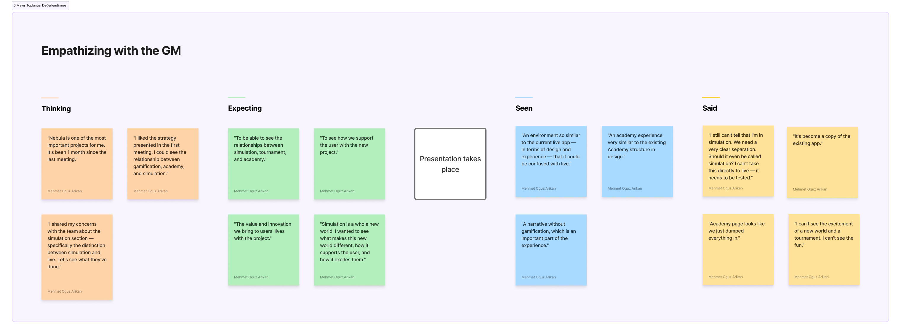
Working closely with the Principal Product Designer, we translated the workshop findings and strategy into a full set of wireframes covering all three pillars. These were detailed enough to present to the client project team and the General Manager, and to get a green light to move into UI design.
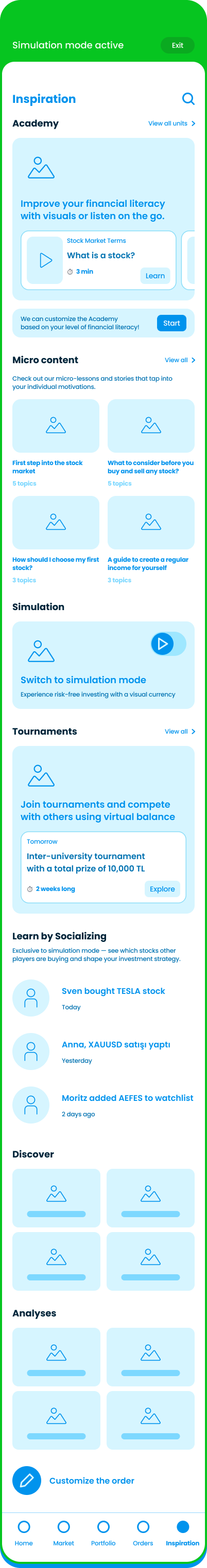
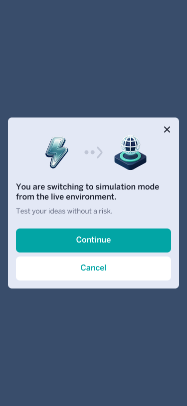
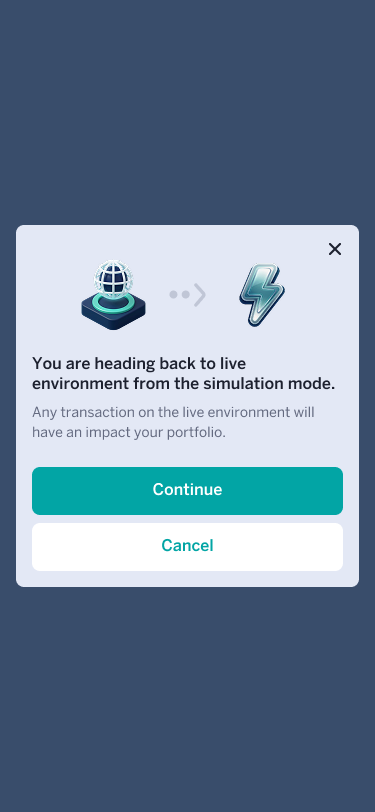
With the green light confirmed, simulation design began. The first two phases were about consistency, not invention. Entry points, the buy and sell flow, order management. Getting the basics right so everything built on top could hold together. The one moment that needed more care was the sandbox-to-live transition. Even with a self-contained simulation model, switching back to real trading had to be unambiguous. Any confusion there carried real risk.
 →
→
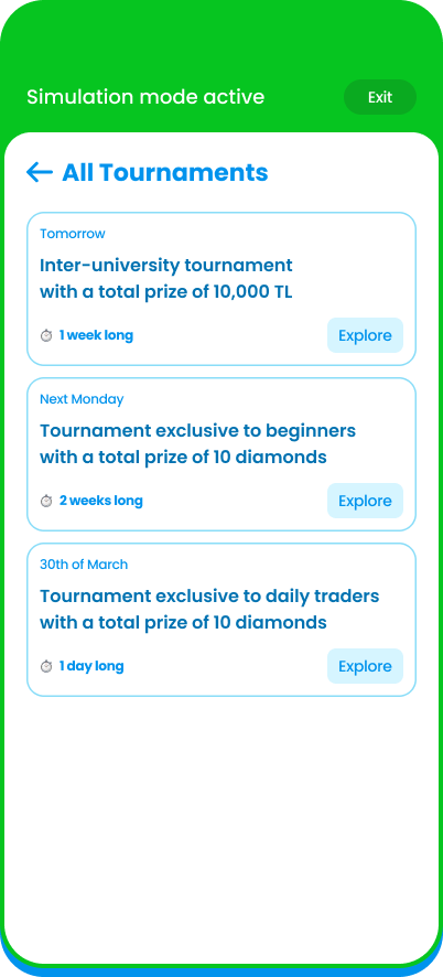
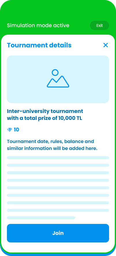
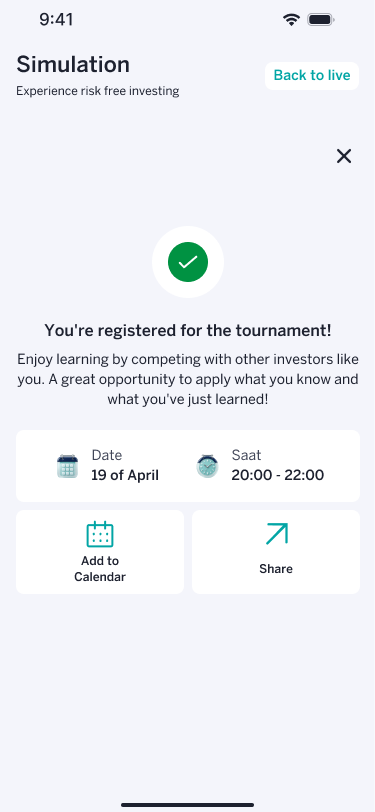
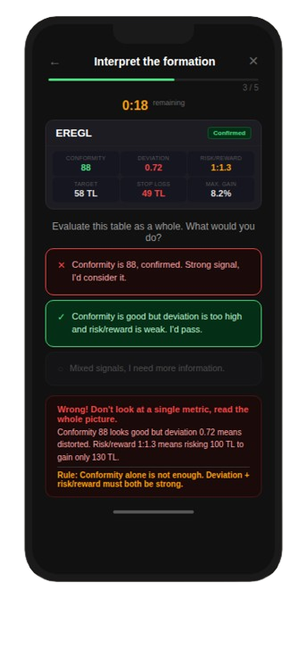
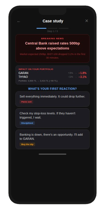
Simulation phases 3 and 4 were a different kind of work. Tournaments, leaderboards, joining and leaving flows, a results view that connected simulated decisions to real outcomes. For the first time the project had space to explore. This phase was built in close collaboration with the client's internal design team, working through directions together across multiple rounds.
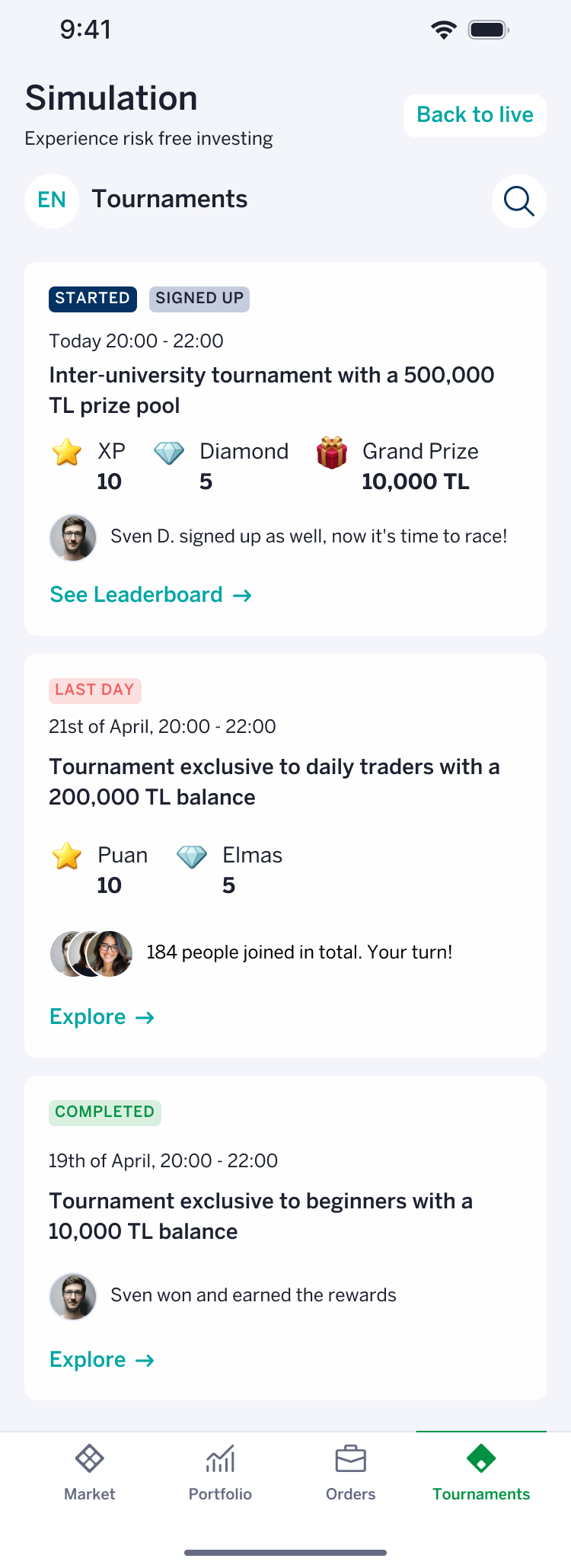
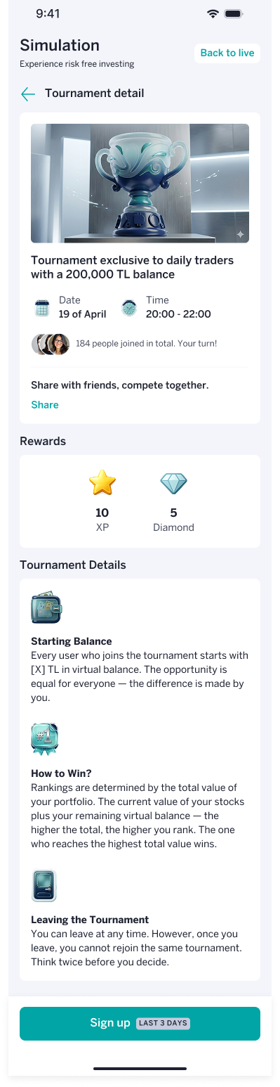
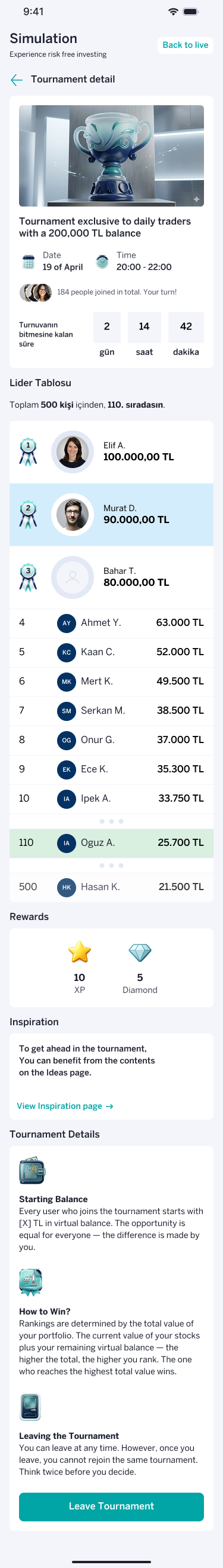
Click to enlarge any design to see in full
The second presentation to the General Manager covered the complete simulation and learning work. Gamification existed only as wireframes at that point. With time pressure, the team had chosen to lead with simulation progress. That choice had consequences.
One fair critique, one that needed translating
Gamification had not been shown in full. A month in, that was a real gap and a fair point. The second note was harder to read: the work looked exactly like the existing app. She pushed us to think beyond the current design system. Taken at face value, that sounded like a visual note. The real point underneath it was structural. Simulation had inherited the app's core problem. It didn't guide the user. It expected them to find their way around.
I didn't react immediately. I wrote down exactly what was said, what she had seen, and what it actually meant before deciding what to change. Translating a blunt comment into a real design problem is its own skill.
Click to enlarge any design to see in full
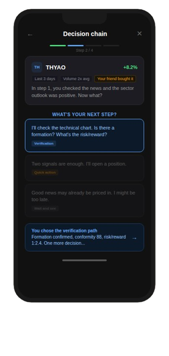
I rebuilt the simulation concept from a different question. Not "how do I trade" but "what am I actually trying to do." The new flow started by asking a user's financial situation and goal, then routed them through the app's existing tools toward a real decision.
I used Claude to map every combination of financial source and goal — nine in total — the tool sequence for each, and the resulting logic. Then I built a working prototype to test it end to end.
Interactive prototype — tap through the flow
After I presented the prototype, the team's feedback was direct: stop focusing on simulation. Gamification needed the attention. The ambitious rebuild didn't ship as designed. A lightweight version did. I delivered wireframes for a simplified buy and sell flow that became part of the final solution.
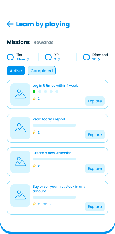
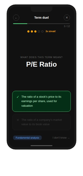
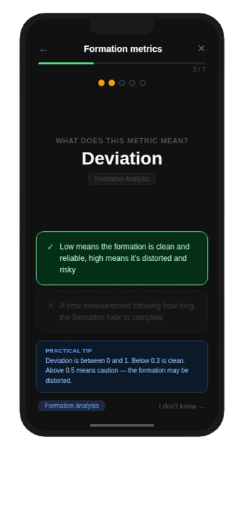
With the redirect clear, I researched fintech and edtech apps on Mobbin for gamification patterns, then used Claude to synthesize the screenshots into a structured pool of 45 candidate mechanics from products like Duolingo, Kahoot, and Brilliant.
"A big pool of mechanics is not a shortcut. The filtering is the real design work. Does it fit investing? Does it work for both personas? Can the team sustain it after launch?"
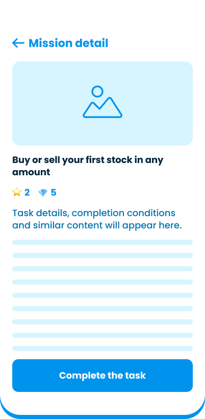
I filtered against four criteria: context fit, persona fit, sustainability, and build complexity. Three mechanics made it through: rapid-fire concept matching, swipe-based signal sorting, and branching market scenarios. I presented these to the loyalty solutions tech company first, then to the client. Both aligned on a focused set of lightweight games.
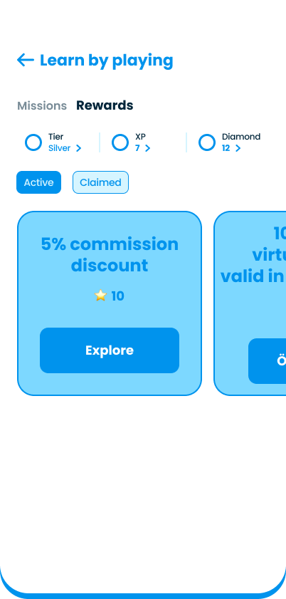
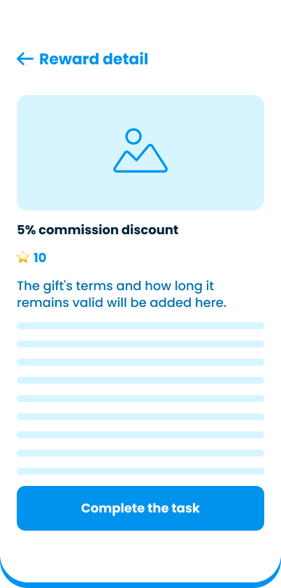
To close the project, two pairs worked from the same brief in parallel: how the gamification structure, tier logic, and user progression should fit together. The two solutions differed. We aligned on the loyalty solutions tech company's approach, set ours aside, and moved into final wireframes together.
AI as a thinking partner, not just a production tool
Mapping nine scenario combinations and synthesizing 45 mechanics from research screenshots would have taken days by hand. Using Claude for both meant more time on judgment, less on assembly.
The exact words are rarely the real note
A stakeholder's exact words are not always the real note. "You look exactly like the existing app" was really "you haven't fixed the thing that was already broken." Learning to hear the second one is worth practicing on every project.