A payment startup was building digital infrastructure for a region where most people don't use banks. Three user types, complex financial logic, a product still being defined. I was the only designer.
MenaPay set out to bring digital payments to a region where banks don't work for most people
More than 80% of the MENA region's population doesn't use banks — not because of poverty, but because the traditional banking system isn't compliant with Islamic finance. MenaPay was built to fill that gap: a blockchain-based payment platform that lets people transact digitally without a bank account.
The MenaPay ecosystem — three user types, each with a distinct role and dashboard need
When I joined, the consumer app was already in development. The dashboards for merchants and resellers, the B2B infrastructure that made the whole system work, hadn't been designed yet. That's where I came in.
2 · Problem (user + business)
Business problem
Two dashboards. Different goals. No existing design.
Merchants and resellers share the same platform but do fundamentally different things. A merchant tracks sales and processes refunds. A reseller manages exchange rates, sets service fees, and converts cash to MenaCash for customers. Both needed onboarding, reporting, and settings — but the core flows had almost nothing in common. Designing two coherent but distinct products in parallel, from scratch, was the core challenge.
Design problem
The product was still being defined
The specs covered happy paths. Edge cases, error states, and business rules were either missing, incomplete, or contradictory across documents. There was no time to wait for clarity — the consumer app was already in development and the deadline didn't move.
3 · Deliverables
Merchant and reseller dashboards, from wireframe to detailed designs and a guide to library of components
The merchant and reseller dashboards shipped as complete, handoff-ready designs: wireframes, UI, component library, and style guide.
2
Dashboards designed: one for merchants, one for MenaCash resellers
E2E
From wireframe to style guide
4 · Approach & rationale
When the specs are incomplete, show a wireframe and drive the conversations
When the specs are incomplete, the fastest way to get answers isn't to ask. Show a wireframe and drive the conversations. and drive the conversations.
1
Understand the design requirements
I started with stakeholder interviews to understand the business model, the three user types, and what each actually needed from a dashboard. The goal wasn't just to understand MenaPay. It was to define what I was designing and for whom.
2
Research competitors for interaction patterns
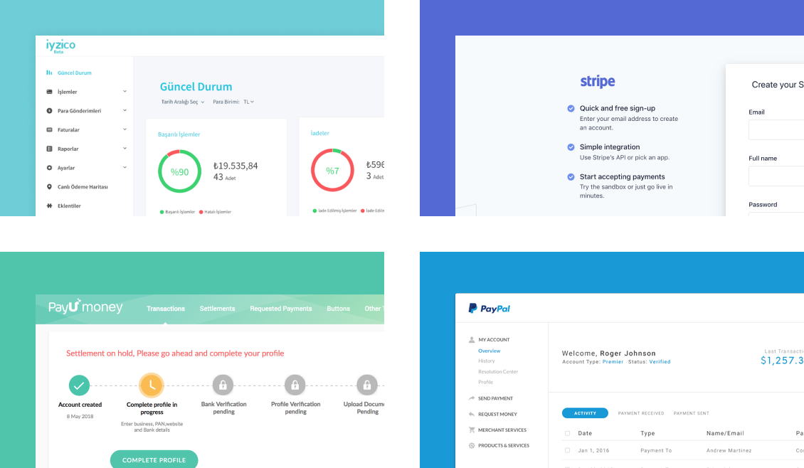
I studied iyzico, Stripe, PayU, and PayPal: not for visual inspiration, but to understand the dashboard patterns merchants already knew. Familiarity reduces learning time, especially for infrequent users.
3
Wireframes to drive the conversation
I started with wireframes even when the team was skeptical. Low-fidelity screens surface undefined rules faster than any document. Every gap in the spec became visible as soon as someone looked at a screen.
4
Build with change in mind
I structured the UI with Sketch symbols, especially for data tables. When a new column or state was added, one change propagated everywhere. On a project with moving requirements, that's not a nice-to-have — it's how you hit the deadline.
One designer. Fixed deadline. Specs that evolved during the build.
5 · Execution
Designing two dashboards from scratch
#1 Map who I'm designing for before touching the UI
I started with stakeholder interviews to understand MenaPay's business model and what each user type actually needed from a dashboard.
From stakeholder interviews
"MenaPay had three target audiences: online merchants, offline merchants, and MenaCash resellers. Each role had different goals on the same platform, and each needed its own dashboard logic."
The interviews made one thing clear: merchant and reseller dashboards would share the same platform but serve fundamentally different goals.
Merchant
Reseller
Primary goal
Accept MenaCash payments, track sales
Sell MenaCash to consumers for cash
Key action
Review and process refunds
Convert cash to MenaCash for customers
Service fee
—
Sets commission on top of exchange rate
Exchange rate
Shared setting
Shared setting — plus margin control
Reports
Sales, transactions, customers
MenaCash sales and wallet balance
Same platform, two distinct roles — each with its own dashboard logic.
Sitemap — 31 screens across two dashboards, 71% shared foundation.
Shared infrastructure, distinct core flows: the scope that made a symbol system necessary.
Competitor analysis followed: iyzico, Stripe, PayU, and PayPal. The focus was interaction patterns: how do users sign up, get verified, and read their dashboard data? These patterns became the structural baseline for the dashboard.
Competitor analysis: sign-up, KYC, onboarding, and dashboard patterns
#2 Build the skeleton from patterns merchants already know
The competitor research fed directly into the skeleton. Each structural decision came from a pattern merchants already knew, not from aesthetics.
Finding from competitors
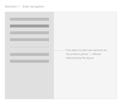
iyzico and Stripe both use side navigation that scales as new sections are added, a pattern merchants already know from other B2B tools.
Design decision
Side navigation as the skeleton foundation. Scalable as the product grows: new sections slot in without restructuring the layout.
Finding from competitors
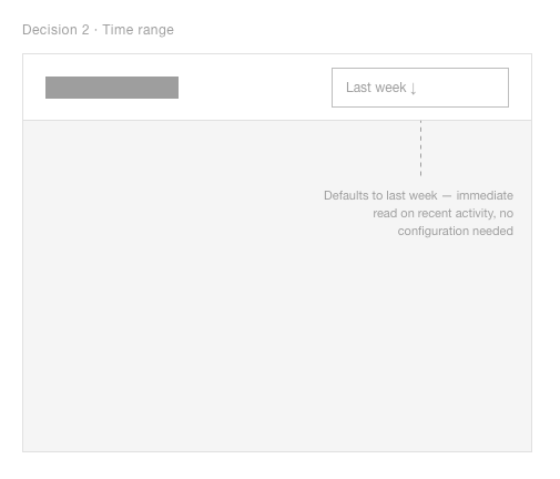
Google Analytics and Stripe place time range selection top-right — merchants already know to look there.
Design decision
Time range selector placed top-right. Default selections (yesterday, last week) so users act immediately without configuring anything.
Finding from competitors
Across all four competitors, actions on list items only appear after selection, keeping the default view clean.
Design decision
Select-to-act pattern throughout. Actions only appear when relevant, reducing cognitive load for infrequent users.
Three structural decisions — each one borrowed from a pattern merchants already knew
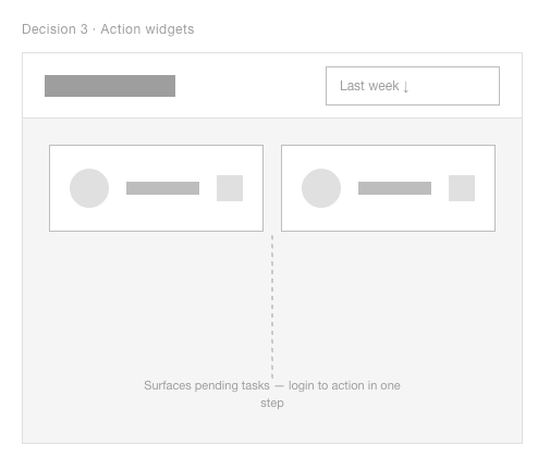
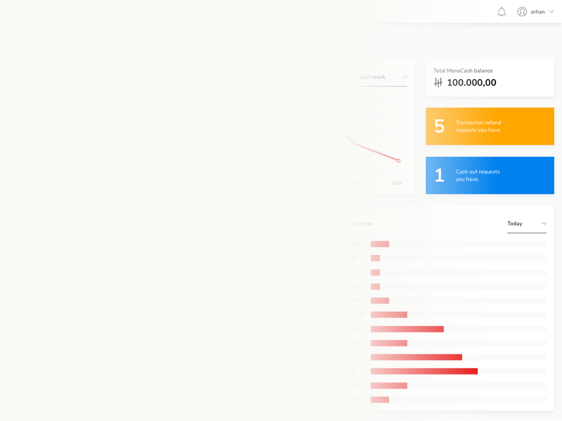
#3 Tell merchants what needs attention the moment they log in
One finding from interviews shaped the dashboard more than anything else: merchants would log in infrequently. They needed to know what required attention the moment they arrived — not after scanning the page.
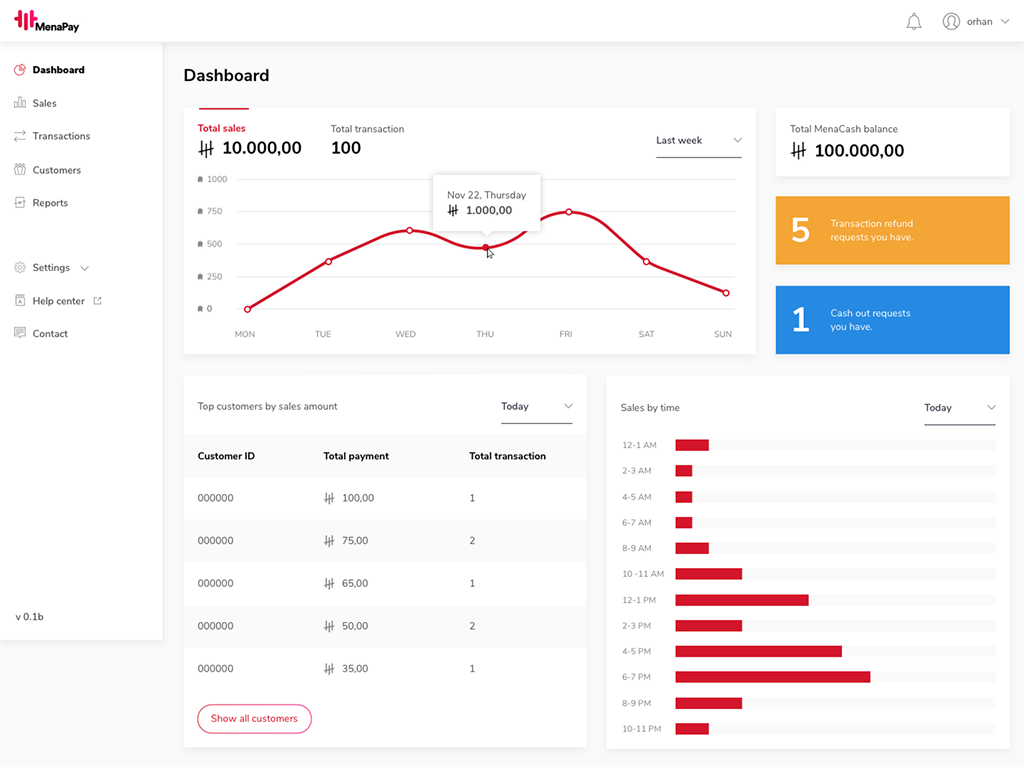
Action widgets surface pending tasks — 5 refund requests, 1 cash-out request — each linking directly to a pre-filtered view. Login to action in one step.
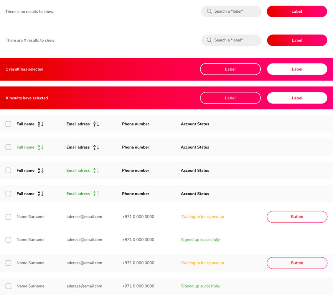
#4 Show actions only when they're relevant
Throughout the dashboard, actions only appear when an item is selected. The default view stays clean. This keeps the interface minimal for infrequent users while making bulk actions available when needed.
Selection triggers the action bar. Nothing is shown until it's relevant. The same symbol powers every table in the dashboard.
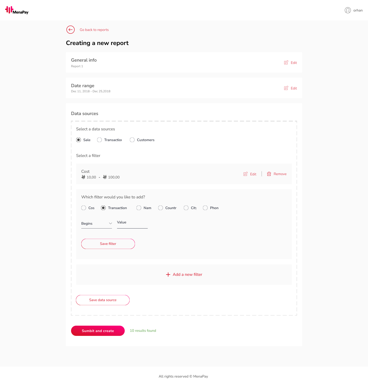
#5 Make complex choices feel like one step at a time
Report creation was the most complex flow in the project. Merchants could combine multiple data sources (Sales, Transactions, Customers), each with its own filter set. The challenge was making a large number of choices feel manageable.
Challenge
Users needed to select data sources and stack multiple filters: a large number of choices in one flow.
Design decision
Divided into steps: data source → filters → summary. Each step shows only what's relevant. A live result count at the bottom gives confidence before submitting.
Challenge
The flow had four distinct decision points that needed to feel connected, not fragmented.
Design decision
Numbered steps (1–4) with a persistent summary at each stage. Users always know where they are and what they've selected.
Four steps, one screen. The complexity is real but the path through it is clear.
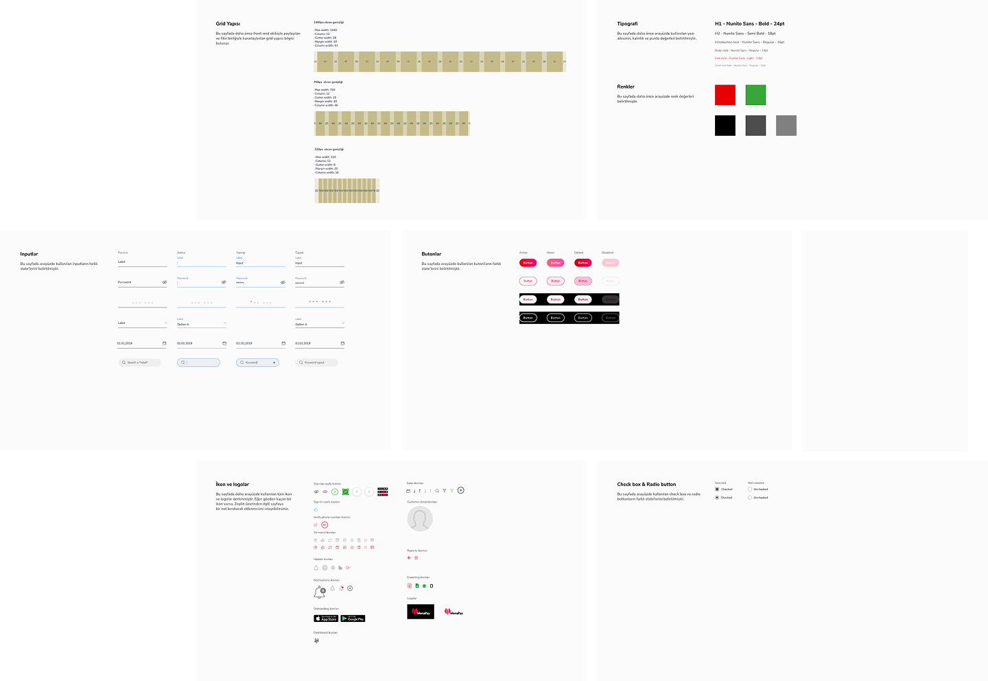
#6 Leave the dev team nothing to guess
The project ended with a complete style guide delivered to the dev team — grid structure, typography, colours, icons, buttons, and form elements. Every component state was documented. The Sketch symbol system meant the guide and the designs stayed in sync.
Developer handoff: every state documented, every component in the symbol library
6 · Outcomes / key insights
Three things that shaped every screen in the project
1
Infrequent users need a different dashboard logic
The less often someone uses a tool, the more it has to do the thinking for them. Passive dashboards don't work for B2B users who aren't daily users.
2
Wireframes don't slow you down. Undefined specs do.
Starting with wireframes on a product still being defined wasn't risky. It was the fastest way to surface decisions that hadn't been made yet.
3
A symbol system is a change-management tool
Building with symbols wasn't just about speed — it was about staying sane when requirements changed. And on an early-stage product, they always change.
These three things — designing for infrequency, forcing decisions early, and building for change — shaped every screen in the project.
7 · Learnings
What I've learned
Start with wireframes, even under resistance
Starting with wireframes, even when the team is skeptical, pays off. It's the fastest way to surface unclear rules and get alignment before committing to detailed UI.
Undefined edge cases are a design problem
Pushing for edge-case decisions isn't slowing the project down. It's the job. Leaving them undefined just moves the problem to development, where they're ten times more expensive to fix.
Bring examples, not arguments
Sharing my knowledge and pushing my limits, even when everyone is against it, is part of being a designer. The wireframe resistance taught me to bring examples, not arguments.